Building 0→1 Products
Hi, I'm Victor welcome
to my space.
Hi, I'm Victor welcome
to my space.
Hey, I’m Victor, a 0→1 Product Designer
turning complex ideas into growth-driven products for VC-backed startups.
I COLLABORATE WITH
I COLLABORATE WITH
Clarity,
Direction, Impact.
Clarity,
Direction, Impact.
You’re not just investing in screens. You’re investing in clarity, stronger product decisions, and outcomes that move the productforward.
You’re not just investing in screens. You’re investing in clarity, stronger product decisions, and outcomes that move the productforward.
01
01
Startups
Startups
Turning early ideas into products people want.
Turning early ideas into products people want.
02
02
Businesses
Businesses
Reworking existing products for what comes next.
Reworking existing products for what comes next.
03
03
Agencies
Agencies
Adding product depth to ambitious client work.
Adding product depth to ambitious client work.
04
04
Scale-ups
Scale-ups
Making growing products easier to use and harder to outgrow.
Making growing products easier to use and harder to outgrow.
05
05
Founders
Founders
Turning vision into something people can actually use.
Turning vision into something people can actually use.
06
06
Tech companies
Tech companies
Designing products built for real-world scale.
Designing products built for real-world scale.
Strategic
UX Strategy
Product Design
Interaction Design
Design Systems
Prototyping
Research
Visual Design
Analytical
Adaptable
Product strategy
AI-Native
WORK
WORK
Built on curiosity,
Built on curiosity,
Clarity & craft.
Clarity & craft.
2022 & 2026
Flippay v4 redesign
Flippay is a fintech platform for gift card trading, crypto transactions, bill payments, and seamless money transfers.
Challenge:
The challenge was redesigning Flippay V4 into a more modern and scalable fintech ecosystem, expanding beyond gift card trading by introducing crypto transactions, Pockets, bill payments, and FlippayTags, while simplifying the overall user experience.
Services:
Mobile Design
Website+App
User flow
Backoffice Design
3 weeks timeline
Role:
Repositioned the product for growth by simplifying complex financial flows and expanding everyday use cases, with the aim of increasing adoption, improving transaction completion, and strengthening user retention. Used AI to accelerate validation, sharpen UX decisions, and reduce iteration cycles.

The Before:
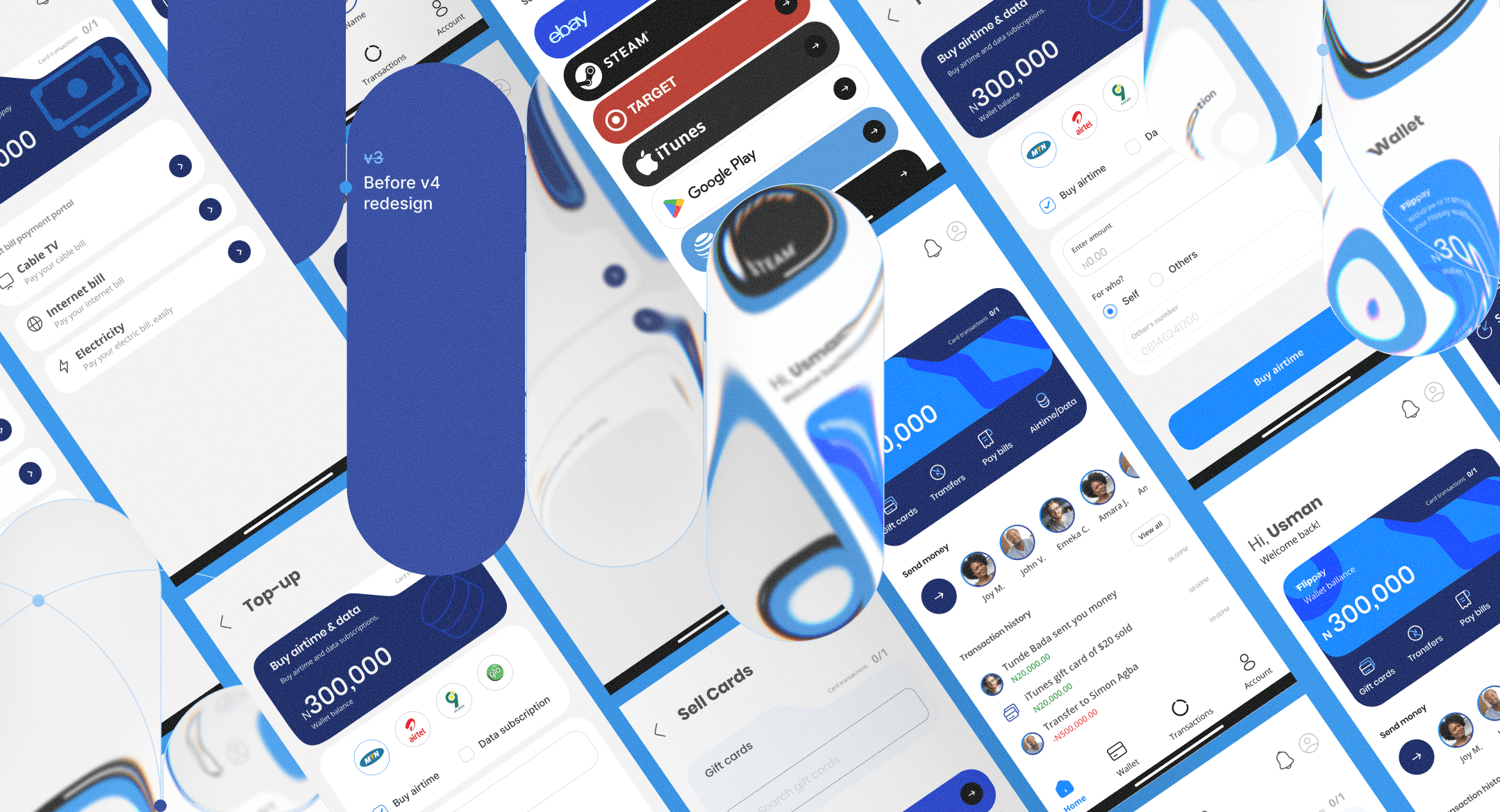
Previous version was broken in areas like, too many steps to complete a trade, unclear flow to send or receive money, lengthy onboarding flow, frustrating UX and broken copies, all these and more led to low adoption and pause on operations.
In v4
For v4, I leveraged AI to refine user flows, validate iterations, improve UX copy, and accelerate feedback using industry-informed insights.


Built Around You:
We’re introducing modular customization, allowing users personalize their navigation, dashboards, asset views, beneficiaries, and themes, with gamified experiences planned for future releases.


Design Decisions:
My key design decisions for V4 experience was, balancing scalability, usability, and feature expansion without overwhelming users. Each decision focused on simplifying complex fintech interactions while creating a more modern and flexible product ecosystem.
Preventing feature overload
The problem was introducing crypto, Pockets, and FlippayTags without making Flippay feel bloated or difficult to navigate. I decided to keep gift card trading as the dominant experience while progressively introducing newer features contextually, because existing users were already familiar with the platform’s original behavior.
Restructuring navigation around user behavior
The problem was that the previous navigation prioritized product categories instead of user intent, making common actions harder to access. I decided to redesign the architecture around actions like “Trade,” “Pay,” and “Send” because users think in outcomes, not platform structure.
Positioning Pockets as organizational tools
The problem was that users needed a way to separate funds without the complexity of savings or investment products. We decided to position Pockets around organization, budgeting and holding, rather than financial returns because the immediate user need was structure, not wealth management.
FlippayTags for transfers
The problem was that account-number-based transfers created friction, hesitation, and frequent transfer errors. By introducing FlippayTags as a username-based transfer system because simpler identifiers reduce cognitive load and make transactions feel faster and more human.
Outcome:
V4 is projected to improve feature adoption by 15–25%, reduce transaction errors by 10–18%, and increase repeat engagement through everyday features like FlippayTags, bill payments, and Pockets.
By expanding beyond gift card trading, Flippay is also positioned for stronger market adoption as a more complete digital transactions ecosystem.
2022 & 2026
Flippay v4 redesign
Flippay is a fintech platform for gift card trading, crypto transactions, bill payments, and seamless money transfers.
Challenge:
The challenge was redesigning Flippay V4 into a more modern and scalable fintech ecosystem, expanding beyond gift card trading by introducing crypto transactions, Pockets, bill payments, and FlippayTags, while simplifying the overall user experience.
Services:
Mobile Design
Website+App
User flow
Backoffice Design
3 weeks timeline
Role:
Repositioned the product for growth by simplifying complex financial flows and expanding everyday use cases, with the aim of increasing adoption, improving transaction completion, and strengthening user retention. Used AI to accelerate validation, sharpen UX decisions, and reduce iteration cycles.
The Before:
Previous version was broken in areas like, too many steps to complete a trade, unclear flow to send or receive money, lengthy onboarding flow, frustrating UX and broken copies, all these and more led to low adoption and pause on operations.
In v4
For v4, I leveraged AI to refine user flows, validate iterations, improve UX copy, and accelerate feedback using industry-informed insights.
Built Around You:
We’re introducing modular customization, allowing users personalize their navigation, dashboards, asset views, beneficiaries, and themes, with gamified experiences planned for future releases.
Design Decisions:
My key design decisions for V4 experience was, balancing scalability, usability, and feature expansion without overwhelming users. Each decision focused on simplifying complex fintech interactions while creating a more modern and flexible product ecosystem.
Preventing feature overload
The problem was introducing crypto, Pockets, and FlippayTags without making Flippay feel bloated or difficult to navigate. I decided to keep gift card trading as the dominant experience while progressively introducing newer features contextually, because existing users were already familiar with the platform’s original behavior.
Restructuring navigation around user behavior
The problem was that the previous navigation prioritized product categories instead of user intent, making common actions harder to access. I decided to redesign the architecture around actions like “Trade,” “Pay,” and “Send” because users think in outcomes, not platform structure.
Positioning Pockets as organizational tools
The problem was that users needed a way to separate funds without the complexity of savings or investment products. We decided to position Pockets around organization, budgeting and holding, rather than financial returns because the immediate user need was structure, not wealth management.
FlippayTags for transfers
The problem was that account-number-based transfers created friction, hesitation, and frequent transfer errors. By introducing FlippayTags as a username-based transfer system because simpler identifiers reduce cognitive load and make transactions feel faster and more human.
Outcome:
V4 is projected to improve feature adoption by 15–25%, reduce transaction errors by 10–18%, and increase repeat engagement through everyday features like FlippayTags, bill payments, and Pockets.
By expanding beyond gift card trading, Flippay is also positioned for stronger market adoption as a more complete digital transactions ecosystem.
2022 & 2026
Flippay v4 redesign
Flippay is a fintech platform for gift card trading, crypto transactions, bill payments, and seamless money transfers.
Challenge:
The challenge was redesigning Flippay V4 into a more modern and scalable fintech ecosystem, expanding beyond gift card trading by introducing crypto transactions, Pockets, bill payments, and FlippayTags, while simplifying the overall user experience.
Services:
Mobile Design
Website+App
User flow
Backoffice Design
3 weeks timeline
Role:
Repositioned the product for growth by simplifying complex financial flows and expanding everyday use cases, with the aim of increasing adoption, improving transaction completion, and strengthening user retention. Used AI to accelerate validation, sharpen UX decisions, and reduce iteration cycles.
The Before:
Previous version was broken in areas like, too many steps to complete a trade, unclear flow to send or receive money, lengthy onboarding flow, frustrating UX and broken copies, all these and more led to low adoption and pause on operations.
In v4
For v4, I leveraged AI to refine user flows, validate iterations, improve UX copy, and accelerate feedback using industry-informed insights.
Built Around You:
We’re introducing modular customization, allowing users personalize their navigation, dashboards, asset views, beneficiaries, and themes, with gamified experiences planned for future releases.
Design Decisions:
My key design decisions for V4 experience was, balancing scalability, usability, and feature expansion without overwhelming users. Each decision focused on simplifying complex fintech interactions while creating a more modern and flexible product ecosystem.
Preventing feature overload
The problem was introducing crypto, Pockets, and FlippayTags without making Flippay feel bloated or difficult to navigate. I decided to keep gift card trading as the dominant experience while progressively introducing newer features contextually, because existing users were already familiar with the platform’s original behavior.
Restructuring navigation around user behavior
The problem was that the previous navigation prioritized product categories instead of user intent, making common actions harder to access. I decided to redesign the architecture around actions like “Trade,” “Pay,” and “Send” because users think in outcomes, not platform structure.
Positioning Pockets as organizational tools
The problem was that users needed a way to separate funds without the complexity of savings or investment products. We decided to position Pockets around organization, budgeting and holding, rather than financial returns because the immediate user need was structure, not wealth management.
FlippayTags for transfers
The problem was that account-number-based transfers created friction, hesitation, and frequent transfer errors. By introducing FlippayTags as a username-based transfer system because simpler identifiers reduce cognitive load and make transactions feel faster and more human.
Outcome:
V4 is projected to improve feature adoption by 15–25%, reduce transaction errors by 10–18%, and increase repeat engagement through everyday features like FlippayTags, bill payments, and Pockets.
By expanding beyond gift card trading, Flippay is also positioned for stronger market adoption as a more complete digital transactions ecosystem.
2024 & 2025
NectarFi self-custodial finance platform
NectarFi helps you send, save, and invest money globally with the freedom and ease of modern digital banking. Raised $170k+
Challenge:
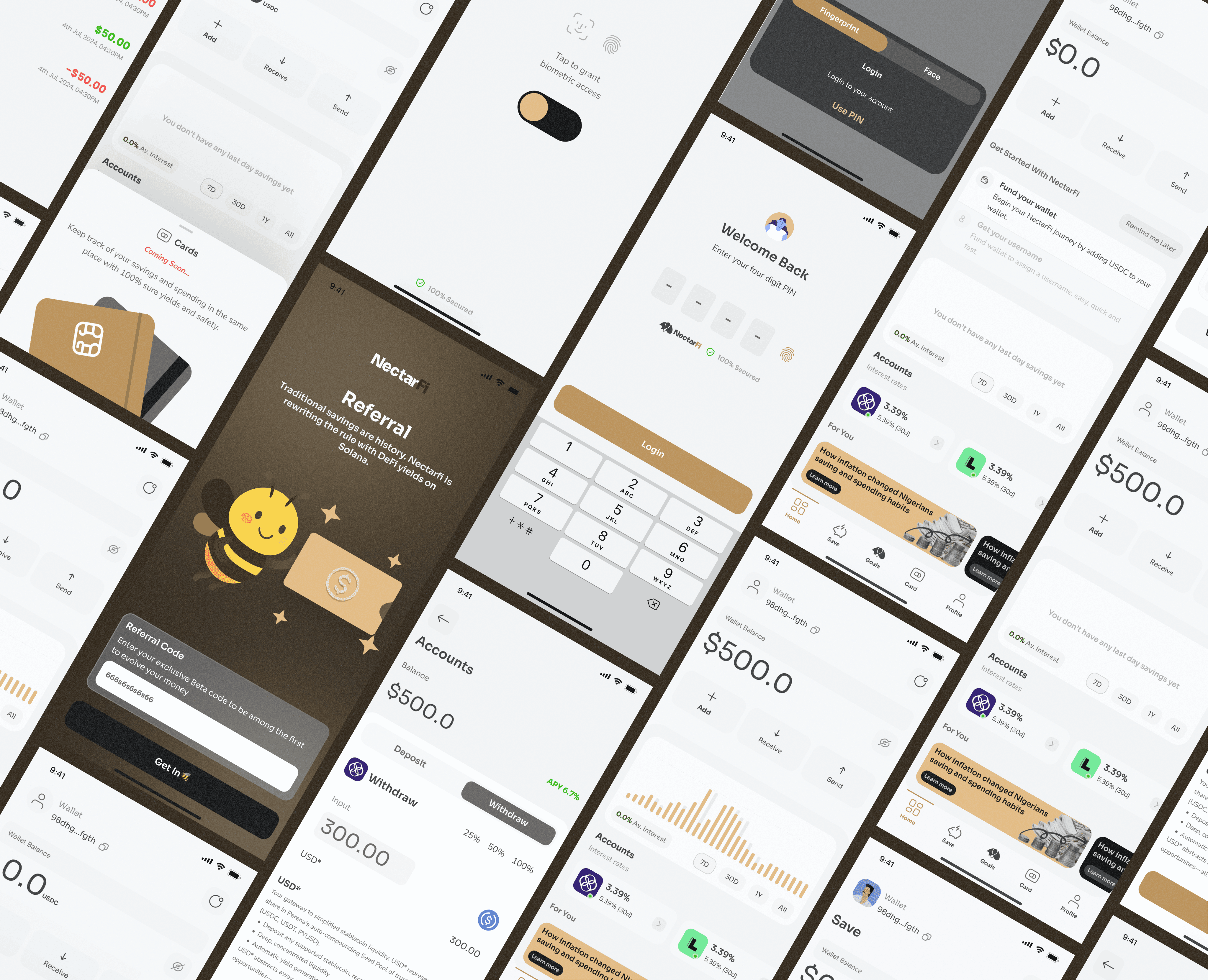
The challenge was establishing NectarFi’s brand direction and visual identity from the ground up, creating a modern fintech presence that felt trustworthy, global, and forward-thinking. Alongside this, I designed the foundational UX and UI system to ensure the product experience aligned seamlessly with the brand.
Services:
Mobile App
Website MVP
User experience
Brand Identity
Pitch decks
Merch designs
Role:
Shaped the brand direction and visual identity to establish a clear, credible fintech presence, with the aim of increasing brand recognition, strengthening user trust, and creating a more consistent foundation for product growth.





Design Decisions:
Building a brand before building a product
The problem was that NectarFi was still an early-stage startup without an established market presence or recognizable identity. I decided to prioritize building a strong visual and brand foundation first because startups need trust, clarity, and differentiation before users can emotionally connect with the product itself.
Designing a scalable identity system
The problem was that the brand needed to work across future products, marketing, and digital experiences as the company grew. I decided to create a flexible and scalable identity system because early-stage startups often outgrow rigid branding quickly, leading to inconsistency and expensive redesigns later on.
Defining the product experience from zero
The problem was that NectarFi existed mostly as an idea, with no clear product direction or UX foundation. I decided to establish the foundational user experience, and design system, shaping the interaction patterns, visual language, and scalable foundations that later influenced future iterations, product decisions.
Outcome:
The branding helped establish NectarFi’s early market identity, creating a more credible and investor-ready perception during its startup phase.
The scalable visual system and foundational product direction later influenced future product iterations, supported stronger brand consistency, and contributed to the company’s growth into a venture-backed startup with over $170k raised in VC funding.
2024 & 2025
NectarFi self-custodial finance platform
NectarFi helps you send, save, and invest money globally with the freedom and ease of modern digital banking. Raised $170k+
Challenge:
The challenge was establishing NectarFi’s brand direction and visual identity from the ground up, creating a modern fintech presence that felt trustworthy, global, and forward-thinking. Alongside this, I designed the foundational UX and UI system to ensure the product experience aligned seamlessly with the brand.
Services:
Mobile App
Website MVP
User experience
Brand Identity
Pitch decks
Merch designs
Role:
Shaped the brand direction and visual identity to establish a clear, credible fintech presence, with the aim of increasing brand recognition, strengthening user trust, and creating a more consistent foundation for product growth.


Design Decisions:
Building a brand before building a product
The problem was that NectarFi was still an early-stage startup without an established market presence or recognizable identity. I decided to prioritize building a strong visual and brand foundation first because startups need trust, clarity, and differentiation before users can emotionally connect with the product itself.
Designing a scalable identity system
The problem was that the brand needed to work across future products, marketing, and digital experiences as the company grew. I decided to create a flexible and scalable identity system because early-stage startups often outgrow rigid branding quickly, leading to inconsistency and expensive redesigns later on.
Defining the product experience from zero
The problem was that NectarFi existed mostly as an idea, with no clear product direction or UX foundation. I decided to establish the foundational user experience, and design system, shaping the interaction patterns, visual language, and scalable foundations that later influenced future iterations, product decisions.
Outcome:
The branding helped establish NectarFi’s early market identity, creating a more credible and investor-ready perception during its startup phase.
The scalable visual system and foundational product direction later influenced future product iterations, supported stronger brand consistency, and contributed to the company’s growth into a venture-backed startup with over $170k raised in VC funding.
2024 & 2025
NectarFi self-custodial finance platform
NectarFi helps you send, save, and invest money globally with the freedom and ease of modern digital banking. Raised $170k+
Challenge:
The challenge was establishing NectarFi’s brand direction and visual identity from the ground up, creating a modern fintech presence that felt trustworthy, global, and forward-thinking. Alongside this, I designed the foundational UX and UI system to ensure the product experience aligned seamlessly with the brand.
Services:
Mobile App
Website MVP
User experience
Brand Identity
Pitch decks
Merch designs
Role:
Shaped the brand direction and visual identity to establish a clear, credible fintech presence, with the aim of increasing brand recognition, strengthening user trust, and creating a more consistent foundation for product growth.
Design Decisions:
Building a brand before building a product
The problem was that NectarFi was still an early-stage startup without an established market presence or recognizable identity. I decided to prioritize building a strong visual and brand foundation first because startups need trust, clarity, and differentiation before users can emotionally connect with the product itself.
Designing a scalable identity system
The problem was that the brand needed to work across future products, marketing, and digital experiences as the company grew. I decided to create a flexible and scalable identity system because early-stage startups often outgrow rigid branding quickly, leading to inconsistency and expensive redesigns later on.
Defining the product experience from zero
The problem was that NectarFi existed mostly as an idea, with no clear product direction or UX foundation. I decided to establish the foundational user experience, and design system, shaping the interaction patterns, visual language, and scalable foundations that later influenced future iterations, product decisions.
Outcome:
The branding helped establish NectarFi’s early market identity, creating a more credible and investor-ready perception during its startup phase.
The scalable visual system and foundational product direction later influenced future product iterations, supported stronger brand consistency, and contributed to the company’s growth into a venture-backed startup with over $170k raised in VC funding.
2024 & 2025
Fable AI + blockchain storytelling platform
Fable is an AI-powered storytelling platform that enables creators to build, monetize, and trade digital story assets through blockchain technology.
Challenge:
The challenge was simplifying the intersection of AI storytelling, digital ownership, and creator monetization into an intuitive platform.
Services:
Website
Web application
User flow
Research
Pitch deck
Role:
Shaped Fable’s experience around AI-powered storytelling, simplifying creation, ownership, and earning to increase creator adoption, engagement, and retention.


Design Decisions:
Simplifying Blockchain Complexity
The challenge was making blockchain concepts approachable for non-technical creators. I simplified ownership, trading, and monetization flows into familiar storytelling actions to reduce friction and improve adoption.
Designing for MVP Validation
The challenge was translating an ambitious long-term vision into a focused MVP. I prioritized the core storytelling and creation experience first, ensuring the product could validate demand before expanding into a broader creator ecosystem.
Outcome:
The MVP is projected to improve creator onboarding by 25–35%, reduce drop-offs across key creation flows by 15–20%, and increase engagement through a more intuitive storytelling experience.
By validating its core creation and ownership loop early, Fable is positioned for stronger market adoption as an AI-powered creator ecosystem.
2024 & 2025
Fable AI + blockchain storytelling platform
Fable is an AI-powered storytelling platform that enables creators to build, monetize, and trade digital story assets through blockchain technology.
Challenge:
The challenge was simplifying the intersection of AI storytelling, digital ownership, and creator monetization into an intuitive platform.
Services:
Website
Web application
User flow
Research
Pitch deck
Role:
Shaped Fable’s experience around AI-powered storytelling, simplifying creation, ownership, and earning to increase creator adoption, engagement, and retention.
Design Decisions:
Simplifying Blockchain Complexity
The challenge was making blockchain concepts approachable for non-technical creators. I simplified ownership, trading, and monetization flows into familiar storytelling actions to reduce friction and improve adoption.
Designing for MVP Validation
The challenge was translating an ambitious long-term vision into a focused MVP. I prioritized the core storytelling and creation experience first, ensuring the product could validate demand before expanding into a broader creator ecosystem.
Outcome:
The MVP is projected to improve creator onboarding by 25–35%, reduce drop-offs across key creation flows by 15–20%, and increase engagement through a more intuitive storytelling experience.
By validating its core creation and ownership loop early, Fable is positioned for stronger market adoption as an AI-powered creator ecosystem.
2024 & 2025
Fable AI + blockchain storytelling platform
Fable is an AI-powered storytelling platform that enables creators to build, monetize, and trade digital story assets through blockchain technology.
Challenge:
The challenge was simplifying the intersection of AI storytelling, digital ownership, and creator monetization into an intuitive platform.
Services:
Website
Web application
User flow
Research
Pitch deck
Role:
Shaped Fable’s experience around AI-powered storytelling, simplifying creation, ownership, and earning to increase creator adoption, engagement, and retention.
Design Decisions:
Simplifying Blockchain Complexity
The challenge was making blockchain concepts approachable for non-technical creators. I simplified ownership, trading, and monetization flows into familiar storytelling actions to reduce friction and improve adoption.
Designing for MVP Validation
The challenge was translating an ambitious long-term vision into a focused MVP. I prioritized the core storytelling and creation experience first, ensuring the product could validate demand before expanding into a broader creator ecosystem.
Outcome:
The MVP is projected to improve creator onboarding by 25–35%, reduce drop-offs across key creation flows by 15–20%, and increase engagement through a more intuitive storytelling experience.
By validating its core creation and ownership loop early, Fable is positioned for stronger market adoption as an AI-powered creator ecosystem.
April, 2026
Ellas' place ERP system
Ella's Place is a fitness and wellness center dedicated to helping individuals achieve their health goals through expert training, structured programs, and a supportive community.
Challenge:
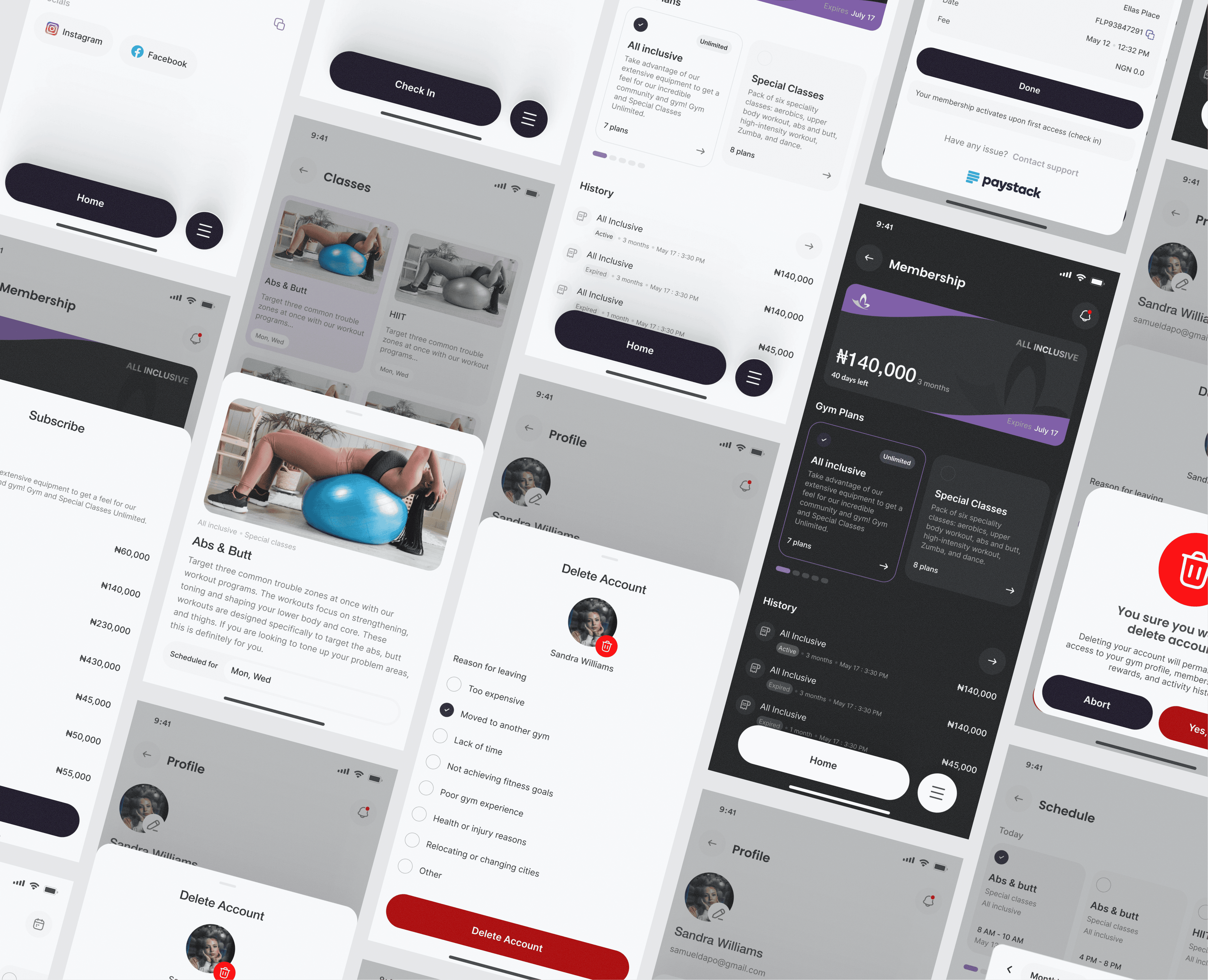
The challenge was creating a modern gym management platform that simplified member experiences and operational workflows across memberships, bookings, check-ins, payments, support, and engagement.
Services:
Gym ERP
Research
User flow
Design system
Logo rework
Backoffice Design
14 days timeline
Role:
Owned the end-to-end product experience across member and staff journeys, with the aim of increasing member retention and revenue, improving booking and payment completion, and reducing operational overhead through more efficient staff workflows.

Side note:
Ella's Place previously used Glofox to manage its operations, but the platform no longer aligned with its evolving needs. The challenge was creating a more tailored ecosystem that streamlined member experiences while giving staff greater control over daily operations, engagement, and growth.


Design Decisions:
Balancing Member and Staff Needs
The challenge was creating a system that served both members and staff without overwhelming either audience. I separated operational tools from member-facing experiences, ensuring each group had a focused experience tailored to their goals and responsibilities.
Simplifying Complex Operations
The problem was consolidating memberships, bookings, payments, support, communication, and reporting into a single platform without making it feel overly complex. I prioritized high-frequency actions and organized features around real gym workflows, making everyday tasks faster and easier to complete.
Moving Beyond Off-the-Shelf Software
The problem was that Glofox's limitations were creating operational bottlenecks as the business grew. I designed a centralized platform tailored to Ella's Place's workflows, giving staff greater control and flexibility across daily operations.
Outcome:
The platform is projected to reduce administrative workload by 25–40%, improve staff task completion rates by 20–30%, and increase member retention by 10–18% through streamlined bookings, communication, rewards, and support experiences. Awaiting further feedback after real use.
April, 2026
Ellas' place ERP system
Ella's Place is a fitness and wellness center dedicated to helping individuals achieve their health goals through expert training, structured programs, and a supportive community.
Challenge:
The challenge was creating a modern gym management platform that simplified member experiences and operational workflows across memberships, bookings, check-ins, payments, support, and engagement.
Services:
Gym ERP
Research
User flow
Design system
Logo rework
Backoffice Design
14 days timeline
Role:
Owned the end-to-end product experience across member and staff journeys, with the aim of increasing member retention and revenue, improving booking and payment completion, and reducing operational overhead through more efficient staff workflows.

Side note:
Ella's Place previously used Glofox to manage its operations, but the platform no longer aligned with its evolving needs. The challenge was creating a more tailored ecosystem that streamlined member experiences while giving staff greater control over daily operations, engagement, and growth.
Design Decisions:
Balancing Member and Staff Needs
The challenge was creating a system that served both members and staff without overwhelming either audience. I separated operational tools from member-facing experiences, ensuring each group had a focused experience tailored to their goals and responsibilities.
Simplifying Complex Operations
The problem was consolidating memberships, bookings, payments, support, communication, and reporting into a single platform without making it feel overly complex. I prioritized high-frequency actions and organized features around real gym workflows, making everyday tasks faster and easier to complete.
Moving Beyond Off-the-Shelf Software
The problem was that Glofox's limitations were creating operational bottlenecks as the business grew. I designed a centralized platform tailored to Ella's Place's workflows, giving staff greater control and flexibility across daily operations.
Outcome:
The platform is projected to reduce administrative workload by 25–40%, improve staff task completion rates by 20–30%, and increase member retention by 10–18% through streamlined bookings, communication, rewards, and support experiences. Awaiting further feedback after real use.
April, 2026
Ellas' place ERP system
Ella's Place is a fitness and wellness center dedicated to helping individuals achieve their health goals through expert training, structured programs, and a supportive community.
Challenge:
The challenge was creating a modern gym management platform that simplified member experiences and operational workflows across memberships, bookings, check-ins, payments, support, and engagement.
Services:
Gym ERP
Research
User flow
Design system
Logo rework
Backoffice Design
14 days timeline
Role:
Owned the end-to-end product experience across member and staff journeys, with the aim of increasing member retention and revenue, improving booking and payment completion, and reducing operational overhead through more efficient staff workflows.
Side note:
Ella's Place previously used Glofox to manage its operations, but the platform no longer aligned with its evolving needs. The challenge was creating a more tailored ecosystem that streamlined member experiences while giving staff greater control over daily operations, engagement, and growth.
Design Decisions:
Balancing Member and Staff Needs
The challenge was creating a system that served both members and staff without overwhelming either audience. I separated operational tools from member-facing experiences, ensuring each group had a focused experience tailored to their goals and responsibilities.
Simplifying Complex Operations
The problem was consolidating memberships, bookings, payments, support, communication, and reporting into a single platform without making it feel overly complex. I prioritized high-frequency actions and organized features around real gym workflows, making everyday tasks faster and easier to complete.
Moving Beyond Off-the-Shelf Software
The problem was that Glofox's limitations were creating operational bottlenecks as the business grew. I designed a centralized platform tailored to Ella's Place's workflows, giving staff greater control and flexibility across daily operations.
Outcome:
The platform is projected to reduce administrative workload by 25–40%, improve staff task completion rates by 20–30%, and increase member retention by 10–18% through streamlined bookings, communication, rewards, and support experiences. Awaiting further feedback after real use.
Dec - Feb 2026
Gonje commerce reimagined.
Gonje is a digital commerce platform that connects buyers, sellers, and service providers through a unified marketplace for products, services, and business transactions.
Challenge:
The challenge was redesigning Gonje into a more intuitive and scalable commerce platform, simplifying complex user flows, and modernizing the interface, by streamlining user journeys, reducing friction across key workflows, and creating a cleaner, more scalable product.
Services:
Mobile Design
Website
User flow
Research
Design system
Logo rework
User journey
Prototyping
Social media posters
Role:
Gonje’s end-to-end experience to strengthen marketplace conversion, improve user retention, reduce journey friction, and position the product for scalable growth.

The Before:
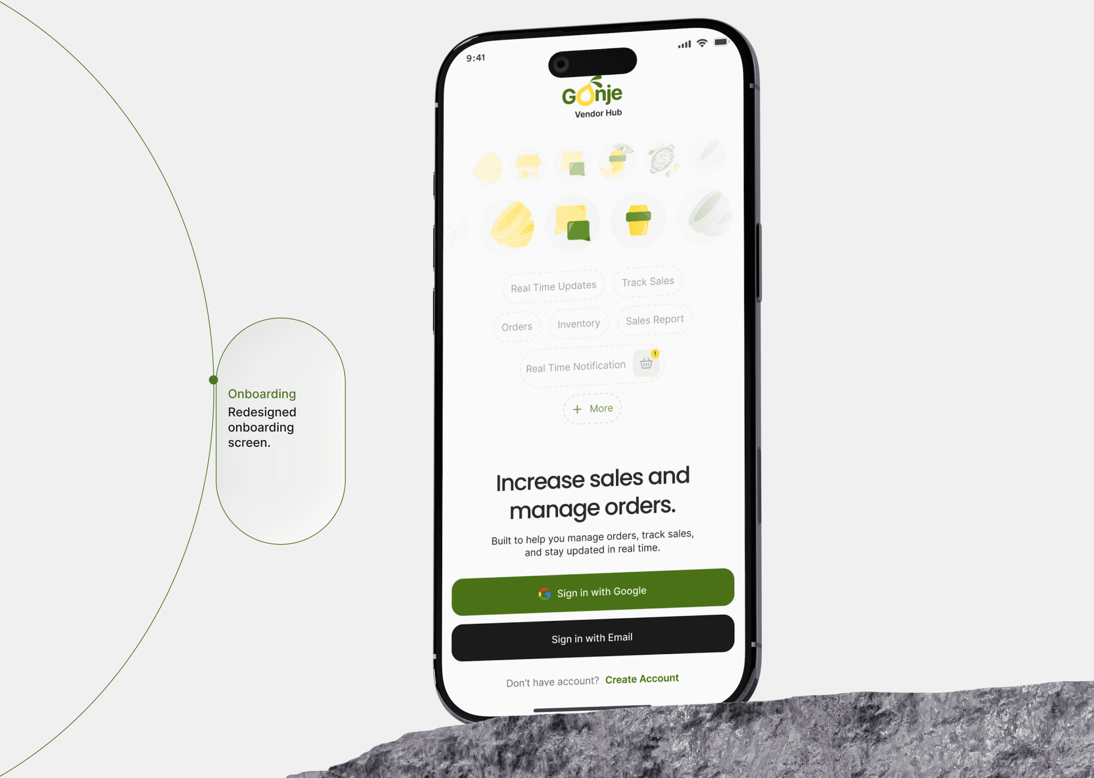
The redesign addressed a number of usability issues that were limiting the product's effectiveness:
Ineffective information hierarchy made high-value actions harder to find.
An overcrowded interface increased cognitive load and obscured critical content.
Inconsistent interaction patterns weakened usability and learnability.
Inefficient navigation introduced unnecessary friction across core user journeys.


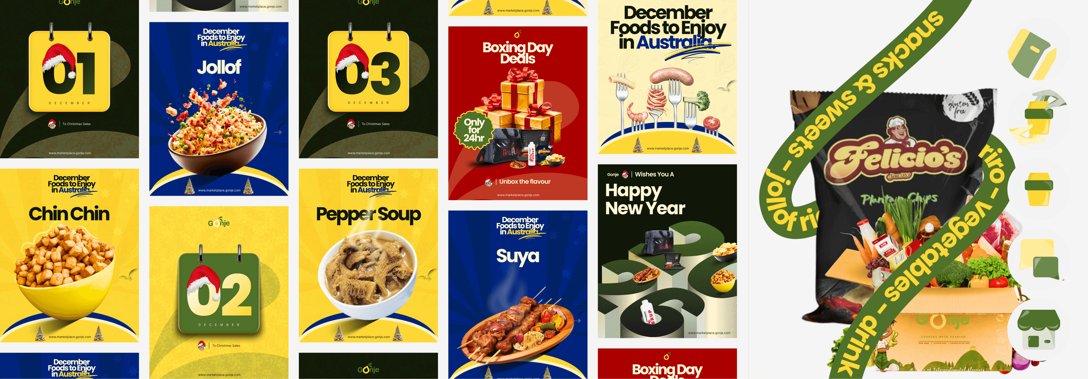
Design Decisions:
Modernizing a Dated Marketplace Experience
The problem was improving Gonje's outdated and cluttered interface without losing the familiarity of its existing marketplace structure. I focused on simplifying navigation, improving content hierarchy, and introducing a cleaner visual system that made product discovery and key actions more intuitive.
Reducing Friction Across Core User Journeys
The problem was that onboarding, browsing, and vendor interactions required unnecessary effort, creating friction across the platform. I streamlined critical workflows, introduced Google sign-in, and adopted familiar commerce patterns to help users complete tasks faster with less confusion.
Outcome:
The redesign is projected to increase onboarding completion by 30–45%, boost marketplace engagement by 15–25%, and reduce user friction by up to 35%, creating a stronger foundation for retention and merchant adoption.
Dec - Feb 2026
Gonje commerce reimagined.
Gonje is a digital commerce platform that connects buyers, sellers, and service providers through a unified marketplace for products, services, and business transactions.
Challenge:
The challenge was redesigning Gonje into a more intuitive and scalable commerce platform, simplifying complex user flows, and modernizing the interface, by streamlining user journeys, reducing friction across key workflows, and creating a cleaner, more scalable product.
Services:
Mobile Design
Website
User flow
Research
Design system
Logo rework
User journey
Prototyping
Social media posters
Role:
Gonje’s end-to-end experience to strengthen marketplace conversion, improve user retention, reduce journey friction, and position the product for scalable growth.
The Before:
The previous version of Gonje faced several usability and design challenges:
• Outdated visual design that lacked the trust and polish expected from modern commerce platforms.
• Poor information hierarchy, making important content and actions difficult to find.
• Cluttered layouts that overwhelmed users and reduced product discoverability.
• Inconsistent UI patterns and navigation, creating confusion across the user journey.

Design Decisions:
Modernizing a Dated Marketplace Experience
The problem was improving Gonje's outdated and cluttered interface without losing the familiarity of its existing marketplace structure. I focused on simplifying navigation, improving content hierarchy, and introducing a cleaner visual system that made product discovery and key actions more intuitive.
Reducing Friction Across Core User Journeys
The problem was that onboarding, browsing, and vendor interactions required unnecessary effort, creating friction across the platform. I streamlined critical workflows, introduced Google sign-in, and adopted familiar commerce patterns to help users complete tasks faster with less confusion.
Outcome:
The redesign is projected to increase onboarding completion by 30–45%, boost marketplace engagement by 15–25%, and reduce user friction by up to 35%, creating a stronger foundation for retention and merchant adoption.
Dec - Feb 2026
Gonje commerce reimagined.
Gonje is a digital commerce platform that connects buyers, sellers, and service providers through a unified marketplace for products, services, and business transactions.
Challenge:
The challenge was redesigning Gonje into a more intuitive and scalable commerce platform, simplifying complex user flows, and modernizing the interface, by streamlining user journeys, reducing friction across key workflows, and creating a cleaner, more scalable product.
Services:
Mobile Design
Website
User flow
Research
Design system
Logo rework
User journey
Prototyping
Social media posters
Role:
Gonje’s end-to-end experience to strengthen marketplace conversion, improve user retention, reduce journey friction, and position the product for scalable growth.
The Before:
The previous version of Gonje faced several usability and design challenges:
• Outdated visual design that lacked the trust and polish expected from modern commerce platforms.
• Poor information hierarchy, making important content and actions difficult to find.
• Cluttered layouts that overwhelmed users and reduced product discoverability.
• Inconsistent UI patterns and navigation, creating confusion across the user journey.
Design Decisions:
Modernizing a Dated Marketplace Experience
The problem was improving Gonje's outdated and cluttered interface without losing the familiarity of its existing marketplace structure. I focused on simplifying navigation, improving content hierarchy, and introducing a cleaner visual system that made product discovery and key actions more intuitive.
Reducing Friction Across Core User Journeys
The problem was that onboarding, browsing, and vendor interactions required unnecessary effort, creating friction across the platform. I streamlined critical workflows, introduced Google sign-in, and adopted familiar commerce patterns to help users complete tasks faster with less confusion.
Outcome:
The redesign is projected to increase onboarding completion by 30–45%, boost marketplace engagement by 15–25%, and reduce user friction by up to 35%, creating a stronger foundation for retention and merchant adoption.
March 2026
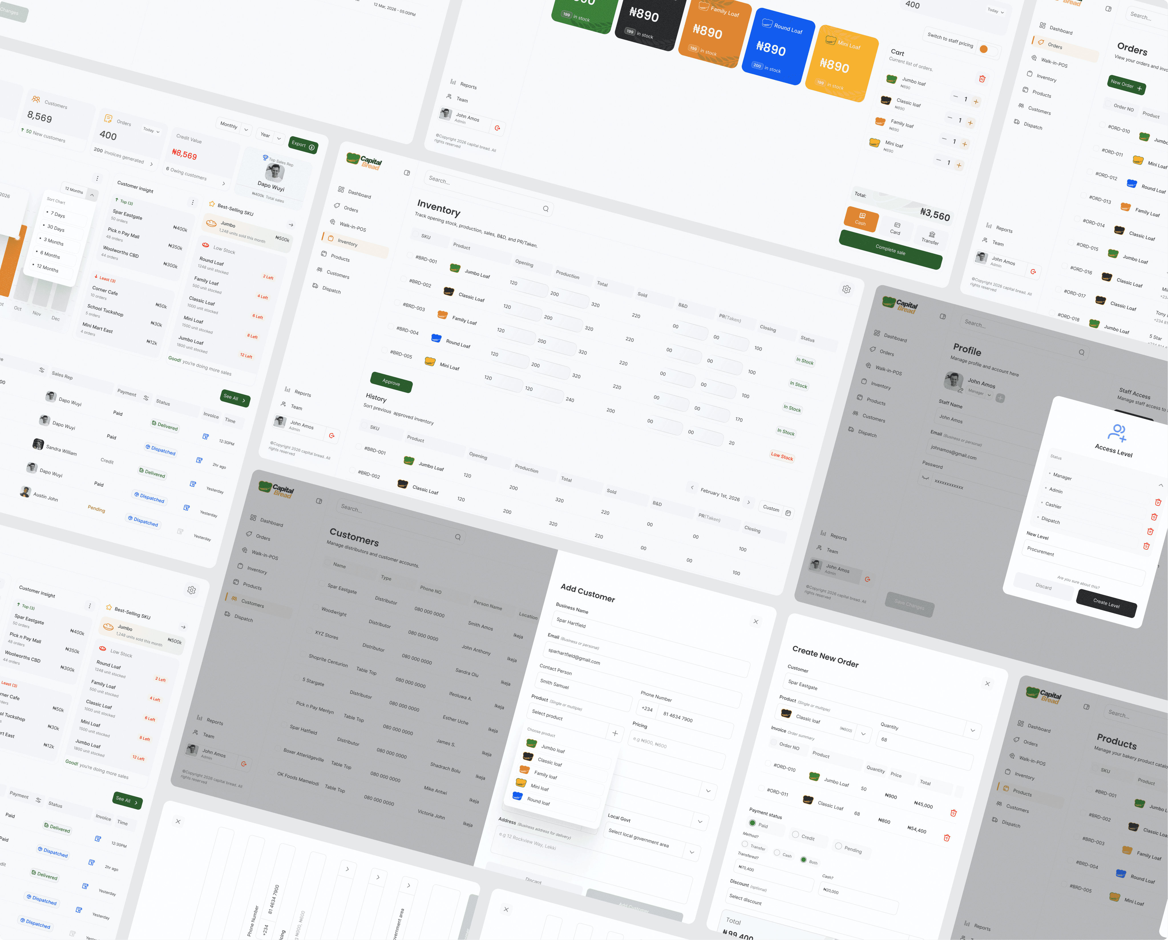
Capital bread DMS system
Bakery Distributor & Sales Management System (DMS) is a bakery operations platform that centralizes sales, inventory, production, dispatch, staff management, and reporting in one system.
Challenge:
The challenge was replacing spreadsheets and manual processes with a centralized platform for managing sales, inventory, production, dispatch, staff, and reporting, while keeping workflows simple for different user roles.
Services:
DMS dashboard
Logo reword
Design system
User flow
Research
12 days timeline
Role:
Designed a scalable bakery management system to reduce operational overhead, improve business visibility, and support faster operational decisions.

Side note:
Designing this from nothing but spreadsheets, meetings, and research meant uncovering operational workflows and turning them into a structured digital system. In the end, turning operational complexities into structured and identifiable patterns helps boost operations for businesses like this

Design Decisions:
Structuring Around Operational Workflows
The problem was replacing disconnected spreadsheets with a single system. I structured the product around the bakery's existing operational flow to make adoption easier and workflows more intuitive.
Role-Based Experience
The problem was serving multiple user roles without overwhelming them. I used role-based navigation and permissions so each user only sees what they need to get their job done.
Actionable Reporting
The problem was giving management visibility into performance without forcing them to dig through raw data. I surfaced key metrics, profit summaries, inventory alerts, and staff performance directly within the dashboard for faster decision-making.
Outcome:
Bakery DMS is projected to reduce manual stock and sales tracking errors by 25–40%, improve operational visibility across inventory, production, and dispatch by 30%+, and speed up order processing and invoice generation by 20–35%.
By consolidating sales, inventory, production, dispatch, staff management, and reporting into one platform, the system positions the bakery for faster decision-making, more accurate profit tracking, and smoother day-to-day operations.
March 2026
Capital bread DMS system
Bakery Distributor & Sales Management System (DMS) is a bakery operations platform that centralizes sales, inventory, production, dispatch, staff management, and reporting in one system.
Challenge:
The challenge was replacing spreadsheets and manual processes with a centralized platform for managing sales, inventory, production, dispatch, staff, and reporting, while keeping workflows simple for different user roles.
Services:
DMS dashboard
Logo reword
Design system
User flow
Research
12 days timeline
Role:
Designed a scalable bakery management system to reduce operational overhead, improve business visibility, and support faster operational decisions.
Side note:
Designing this from nothing but spreadsheets, meetings, and research meant uncovering operational workflows and turning them into a structured digital system. In the end, turning operational complexities into structured and identifiable patterns helps boost operations for businesses like this
Design Decisions:
Structuring Around Operational Workflows
The problem was replacing disconnected spreadsheets with a single system. I structured the product around the bakery's existing operational flow to make adoption easier and workflows more intuitive.
Role-Based Experience
The problem was serving multiple user roles without overwhelming them. I used role-based navigation and permissions so each user only sees what they need to get their job done.
Actionable Reporting
The problem was giving management visibility into performance without forcing them to dig through raw data. I surfaced key metrics, profit summaries, inventory alerts, and staff performance directly within the dashboard for faster decision-making.
Outcome:
Bakery DMS is projected to reduce manual stock and sales tracking errors by 25–40%, improve operational visibility across inventory, production, and dispatch by 30%+, and speed up order processing and invoice generation by 20–35%.
By consolidating sales, inventory, production, dispatch, staff management, and reporting into one platform, the system positions the bakery for faster decision-making, more accurate profit tracking, and smoother day-to-day operations.
March 2026
Capital bread DMS system
Bakery Distributor & Sales Management System (DMS) is a bakery operations platform that centralizes sales, inventory, production, dispatch, staff management, and reporting in one system.
Challenge:
The challenge was replacing spreadsheets and manual processes with a centralized platform for managing sales, inventory, production, dispatch, staff, and reporting, while keeping workflows simple for different user roles.
Services:
DMS dashboard
Logo reword
Design system
User flow
Research
12 days timeline
Role:
Designed a scalable bakery management system to reduce operational overhead, improve business visibility, and support faster operational decisions.
Side note:
Designing this from nothing but spreadsheets, meetings, and research meant uncovering operational workflows and turning them into a structured digital system. In the end, turning operational complexities into structured and identifiable patterns helps boost operations for businesses like this
Design Decisions:
Structuring Around Operational Workflows
The problem was replacing disconnected spreadsheets with a single system. I structured the product around the bakery's existing operational flow to make adoption easier and workflows more intuitive.
Role-Based Experience
The problem was serving multiple user roles without overwhelming them. I used role-based navigation and permissions so each user only sees what they need to get their job done.
Actionable Reporting
The problem was giving management visibility into performance without forcing them to dig through raw data. I surfaced key metrics, profit summaries, inventory alerts, and staff performance directly within the dashboard for faster decision-making.
Outcome:
Bakery DMS is projected to reduce manual stock and sales tracking errors by 25–40%, improve operational visibility across inventory, production, and dispatch by 30%+, and speed up order processing and invoice generation by 20–35%.
By consolidating sales, inventory, production, dispatch, staff management, and reporting into one platform, the system positions the bakery for faster decision-making, more accurate profit tracking, and smoother day-to-day operations.
May 2026
Huboly MVP design
Huboly is a community operating system that helps organizations manage contacts, communication, forms, and workflows through one connected platform.
Challenge:
The challenge was creating a unified platform that could replace fragmented tools and manual processes with a single system for managing people, communication, forms, and workflows across the website, core application, and administrative back office.
Services:
Website
Main App
User flow
Design system
Prototype
Brand positioning
Backoffice Design
Role:
Huboly’s end-to-end product experience across web, mobile, and back-office, with the aim of reducing product friction, increasing adoption and retention, and creating a scalable foundation for growth.

The Before:
Inconsistent spacing and layout rhythm
A visually unpolished page signals low credibility to first-time visitors, increasing the likelihood they bounce before reading a single feature, directly hurting top-of-funnel conversion.
Low-impact CTAs
Weak calls-to-action at critical scroll points means revenue is being left on the table every single day. Even a modest improvement in CTA visibility can compound into thousands in additional monthly recurring revenue.
The design broke from brand standards.
The landing page ignores core brand guidelines, this visual disconnect erodes user trust, when marketing clashes with the product interface, users subconsciously perceive the brand as uncoordinated, making them hesitant to trust the platform with their organizational data.


Design Decisions:
Creating a Unified Ecosystem
The problem was creating consistency across the website, core platform, and back-office experience. I established a unified design language and shared interaction patterns to ensure users could move between products without relearning the system.
Replacing Fragmented Workflows
The problem was that organizations relied on disconnected tools for contacts, communication, and follow-ups. I designed Huboly around a single operational workflow, reducing tool switching and creating a more connected experience.
Built for Adoption
The problem was introducing a new operational system without creating a steep learning curve. I focused on familiar patterns and clear workflows to make adoption feel natural.
Outcome:
Huboly is positioned to improve operational efficiency by 20–30%, reduce manual administrative work by 25–40%, and increase team adoption through a simpler, more connected approach to managing people, communication, and workflows.
May 2026
Huboly MVP design
Huboly is a community operating system that helps organizations manage contacts, communication, forms, and workflows through one connected platform.
Challenge:
The challenge was creating a unified platform that could replace fragmented tools and manual processes with a single system for managing people, communication, forms, and workflows across the website, core application, and administrative back office.
Services:
Website
Main App
User flow
Design system
Prototype
Brand positioning
Backoffice Design
Role:
Huboly’s end-to-end product experience across web, mobile, and back-office, with the aim of reducing product friction, increasing adoption and retention, and creating a scalable foundation for growth.
The Before:
Inconsistent spacing and layout rhythm
A visually unpolished page signals low credibility to first-time visitors, increasing the likelihood they bounce before reading a single feature, directly hurting top-of-funnel conversion.
Low-impact CTAs
Weak calls-to-action at critical scroll points means revenue is being left on the table every single day. Even a modest improvement in CTA visibility can compound into thousands in additional monthly recurring revenue.
The design broke from brand standards.
The landing page ignores core brand guidelines, this visual disconnect erodes user trust, when marketing clashes with the product interface, users subconsciously perceive the brand as uncoordinated, making them hesitant to trust the platform with their organizational data.
Design Decisions:
Creating a Unified Ecosystem
The problem was creating consistency across the website, core platform, and back-office experience. I established a unified design language and shared interaction patterns to ensure users could move between products without relearning the system.
Replacing Fragmented Workflows
The problem was that organizations relied on disconnected tools for contacts, communication, and follow-ups. I designed Huboly around a single operational workflow, reducing tool switching and creating a more connected experience.
Built for Adoption
The problem was introducing a new operational system without creating a steep learning curve. I focused on familiar patterns and clear workflows to make adoption feel natural.
Outcome:
Huboly is positioned to improve operational efficiency by 20–30%, reduce manual administrative work by 25–40%, and increase team adoption through a simpler, more connected approach to managing people, communication, and workflows.
May 2026
Huboly MVP design
Huboly is a community operating system that helps organizations manage contacts, communication, forms, and workflows through one connected platform.
Challenge:
The challenge was creating a unified platform that could replace fragmented tools and manual processes with a single system for managing people, communication, forms, and workflows across the website, core application, and administrative back office.
Services:
Website
Main App
User flow
Design system
Prototype
Brand positioning
Backoffice Design
Role:
Huboly’s end-to-end product experience across web, mobile, and back-office, with the aim of reducing product friction, increasing adoption and retention, and creating a scalable foundation for growth.
The Before:
Inconsistent spacing and layout rhythm
A visually unpolished page signals low credibility to first-time visitors, increasing the likelihood they bounce before reading a single feature, directly hurting top-of-funnel conversion.
Low-impact CTAs
Weak calls-to-action at critical scroll points means revenue is being left on the table every single day. Even a modest improvement in CTA visibility can compound into thousands in additional monthly recurring revenue.
The design broke from brand standards.
The landing page ignores core brand guidelines, this visual disconnect erodes user trust, when marketing clashes with the product interface, users subconsciously perceive the brand as uncoordinated, making them hesitant to trust the platform with their organizational data.
Design Decisions:
Creating a Unified Ecosystem
The problem was creating consistency across the website, core platform, and back-office experience. I established a unified design language and shared interaction patterns to ensure users could move between products without relearning the system.
Replacing Fragmented Workflows
The problem was that organizations relied on disconnected tools for contacts, communication, and follow-ups. I designed Huboly around a single operational workflow, reducing tool switching and creating a more connected experience.
Built for Adoption
The problem was introducing a new operational system without creating a steep learning curve. I focused on familiar patterns and clear workflows to make adoption feel natural.
Outcome:
Huboly is positioned to improve operational efficiency by 20–30%, reduce manual administrative work by 25–40%, and increase team adoption through a simpler, more connected approach to managing people, communication, and workflows.
2024 & 2025
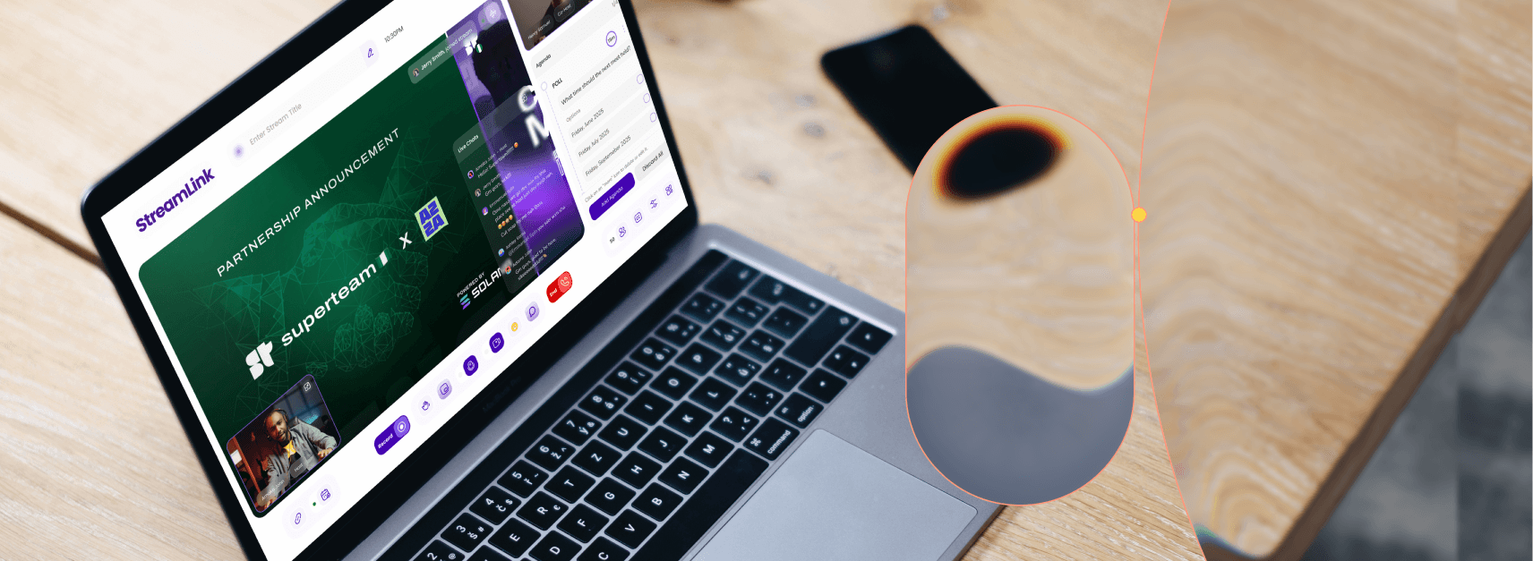
Streamlink MVP cleanup
Live video streaming platform, powered by
SuperteamNG built on Solana
Challenge:
The challenge was simplifying Streamlink's creator ecosystem while unifying subscriptions, digital products, events, and community management into one seamless experience.
Services:
Mobile Design
Website+App
User flow
Prototype
Research
Role:
Owned the end-to-end redesign of Streamlink, improving the user experience and creating a more cohesive platform for creators.

The Before:
What do I say, it didn't just work, it was consistently breaking, and thousands of community members couldn't make out the UX and the UI wasn't any help.


Design Decisions:
Simplified Meeting Access
The problem was users struggling to locate key actions like joining or creating meetings. I restructured navigation and surfaced primary actions more prominently to reduce friction.
In-Chat Monetization
The problem was monetization features feeling disconnected from the streaming experience. I integrated tipping, subscriptions, and paid interactions directly within chat and live sessions.
Cleaner Product Experience
The problem was a cluttered interface with inconsistent patterns. I simplified layouts, improved hierarchy, and created a more intuitive experience across the platform by creating a robust design system tailored to fit her needs.
Outcome:
The redesign helped over 5,000+ users successfully join meetings with significantly less friction, while meeting-access complaints dropped to zero after launch.
Streamlink is projected to increase meeting participation by 20–35%, improve monetization feature adoption by 15–25%, and boost user retention by 10–18% through a simpler, more intuitive streaming experience.
Streamlink MVP cleanup
Live video streaming platform, powered by SuperteamNG built on Solana
2024 & 2025
Challenge:
The challenge was simplifying Streamlink's creator ecosystem while unifying subscriptions, digital products, events, and community management into one seamless experience.
Services:
Mobile Design
Website+App
User flow
Prototype
Research
Role:
Owned the end-to-end redesign of Streamlink, improving the user experience and creating a more cohesive platform for creators.
The Before:
What do I say, it didn't just work, it was consistently breaking, and thousands of community members couldn't make out the UX and the UI wasn't any help.
Design Decisions:
Simplified Meeting Access
The problem was users struggling to locate key actions like joining or creating meetings. I restructured navigation and surfaced primary actions more prominently to reduce friction.
In-Chat Monetization
The problem was monetization features feeling disconnected from the streaming experience. I integrated tipping, subscriptions, and paid interactions directly within chat and live sessions.
Cleaner Product Experience
The problem was a cluttered interface with inconsistent patterns. I simplified layouts, improved hierarchy, and created a more intuitive experience across the platform by creating a robust design system tailored to fit her needs.
Outcome:
The redesign helped over 5,000+ users successfully join meetings with significantly less friction, while meeting-access complaints dropped to zero after launch.
Streamlink is projected to increase meeting participation by 20–35%, improve monetization feature adoption by 15–25%, and boost user retention by 10–18% through a simpler, more intuitive streaming experience.
Streamlink MVP cleanup
Live video streaming platform, powered by SuperteamNG built on Solana
2024 & 2025
Challenge:
The challenge was simplifying Streamlink's creator ecosystem while unifying subscriptions, digital products, events, and community management into one seamless experience.
Services:
Mobile Design
Website+App
User flow
Prototype
Research
Role:
Owned the end-to-end redesign of Streamlink, improving the user experience and creating a more cohesive platform for creators.
The Before:
What do I say, it didn't just work, it was consistently breaking, and thousands of community members couldn't make out the UX and the UI wasn't any help.
Design Decisions:
Simplified Meeting Access
The problem was users struggling to locate key actions like joining or creating meetings. I restructured navigation and surfaced primary actions more prominently to reduce friction.
In-Chat Monetization
The problem was monetization features feeling disconnected from the streaming experience. I integrated tipping, subscriptions, and paid interactions directly within chat and live sessions.
Cleaner Product Experience
The problem was a cluttered interface with inconsistent patterns. I simplified layouts, improved hierarchy, and created a more intuitive experience across the platform by creating a robust design system tailored to fit her needs.
Outcome:
The redesign helped over 5,000+ users successfully join meetings with significantly less friction, while meeting-access complaints dropped to zero after launch.
Streamlink is projected to increase meeting participation by 20–35%, improve monetization feature adoption by 15–25%, and boost user retention by 10–18% through a simpler, more intuitive streaming experience.
